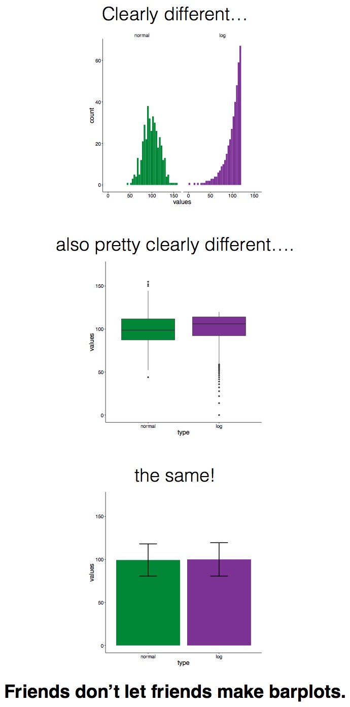
We are a group of young scientists interested in improving scientific communication. One recurrent problem we've noticed, that touches almost all fields of data-driven science, is data visualization. While there exist a wide array of ways to display data, many people choose to use bar plots, a simple graph depicting a group mean and standard error (or deviation). Unfortunately, most data aren't as clean as bar plots make them seem, and since bar plots reveal very little about the distribution of the data, this kind of visualization can be misleading.
We've all been there: the papers we read, presentations we attend, posters we see, they all use bar plots, and we do it too! But just because a practice is standard doesn't mean it should continue. That's why we started our #barbarplots initiative on Kickstarter in May 2016. While we don't believe that an outright ban on bar plots is necessary, the real goal of our project is to increase awareness of the limitations that bar plots have and the need for clear and complete data visualization. Specifically, we have made t-shirts reproducing a widely-shared meme, and are sending them to the editors of the following journals and ask them to take selfies of themselves wearing the shirts and post them to social media, in an effort to mediatize the situation and get people talking. Follow us here for more updates on the campaign as we move beyond the Kickstarter to spread the word about better data visualization!